Gnuplot 08 Mar 2011
Gnuplot is a handy-dandy tool for drawing graphs, which not enough people know about. One of its nicest features is that it is fast for large data sets. Take, for example, this plot of response times for calls to an external service which I scrubbed out of some logs a while back::
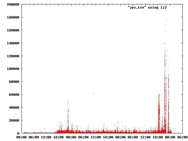
It was generated in gnuplot from a six hundrend thousand or so line, tab delimited file of times and durations, which looked like:
2010-07-20T01:10:05	368
2010-07-20T01:10:24	368
2010-07-20T01:10:40	332
2010-07-20T01:10:58	328
2010-07-20T01:11:15	518
2010-07-20T01:12:02	131
2010-07-20T01:12:02	167
2010-07-20T01:12:02	445
2010-07-20T01:12:09	105
2010-07-20T01:12:09	274
I like to work in interactive mode, so this was rendered via the following commands, in the interactive prompt:
gnuplot> set xdata time
gnuplot> set timefmt '%Y-%m-%dT%H:%M:%S'
gnuplot> set format x '%R'
gnuplot> set terminal png size 640,480
gnuplot> set output '/tmp/graph.png'
gnuplot> plot 'zps.tsv' using 1:2 with dots
To summarize each line we tell it that the X axis is time, give it the time format to read, set the output format for the X axis to be just times, specify png output and size, specify the output file, and then tell it to plot.
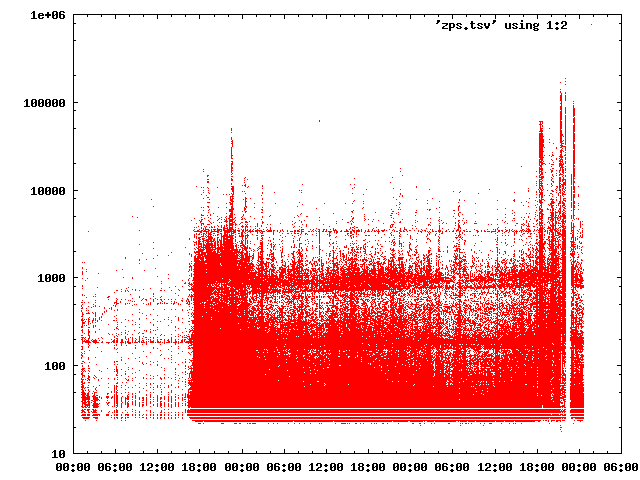
Gnuplot has lots more that it can do, one easy and common one is to switch to log scale. Given our previous commands, we can re-render with the Y axis in log scale via:
gnuplot> set logscale y
gnuplot> set output '/tmp/graph-logscale.png'
gnuplot> plot 'zps.tsv' using 1:2 with dots
Which gives us something easier which can be a bit easier to see things outside the outliers around the downtime near the end.
It can do some analysis, not nearly what R can do, but really only that related to plotting graphs. It can do other fun things, like three dimensional plots, heat maps, etc. Check out the documentation and have fun!